Power-ups
Display power-ups
Display power-ups overview
Display power-ups are standalone tools your bot can call to render rich visuals directly in chat. Instead of replying with a plain text list, the bot can hand back cards, a chart, a table, a map, or a Mermaid diagram and the chat interface takes care of rendering it.
Display power-ups do not fetch data on their own. The bot assembles content from whatever it already has in context - the conversation so far, your data sources, and results from other power-ups - then calls a display power-up to present it visually.
There are five display power-ups:
- Cards - a carousel or stacked list of items with titles, descriptions, images, and links.
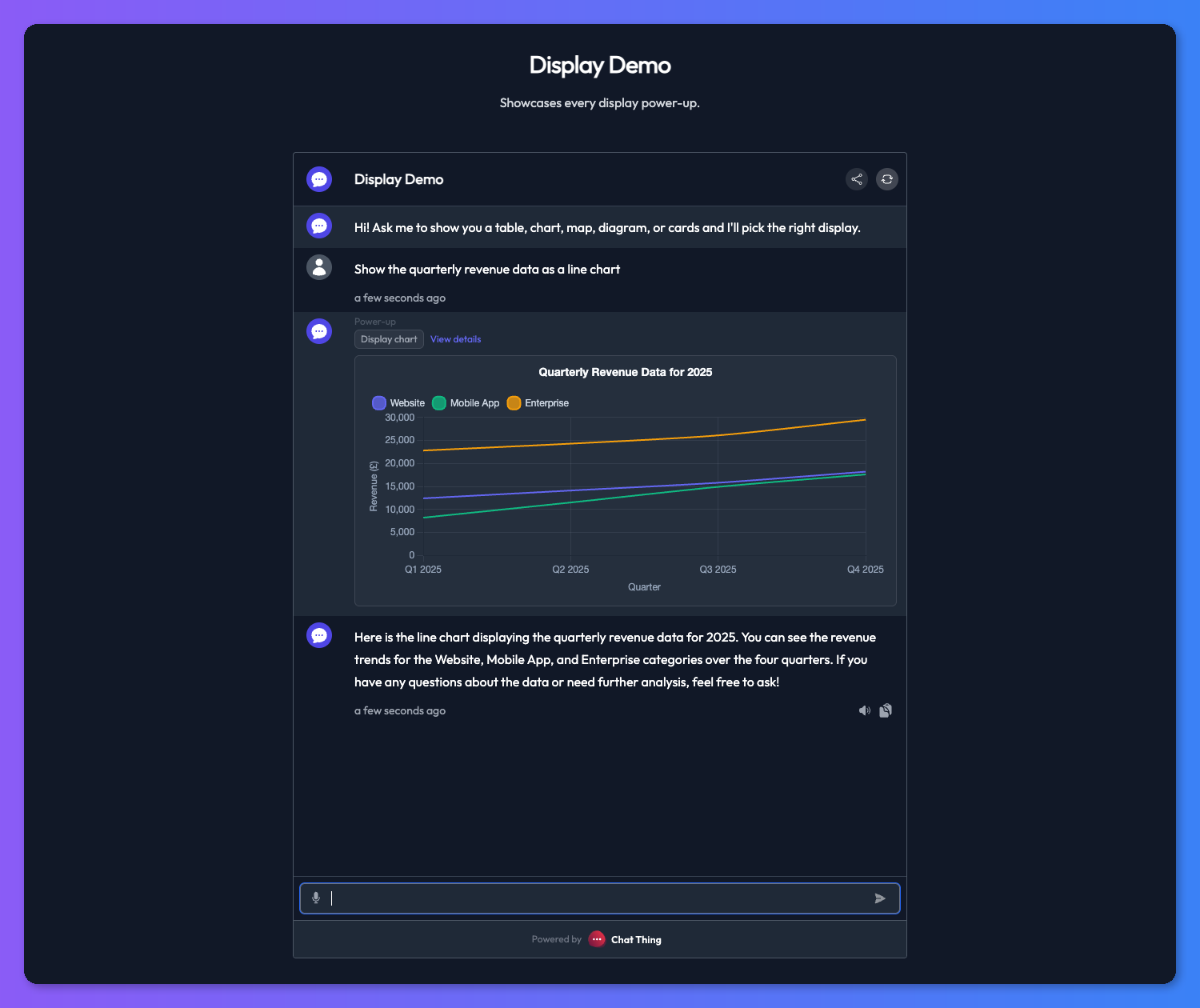
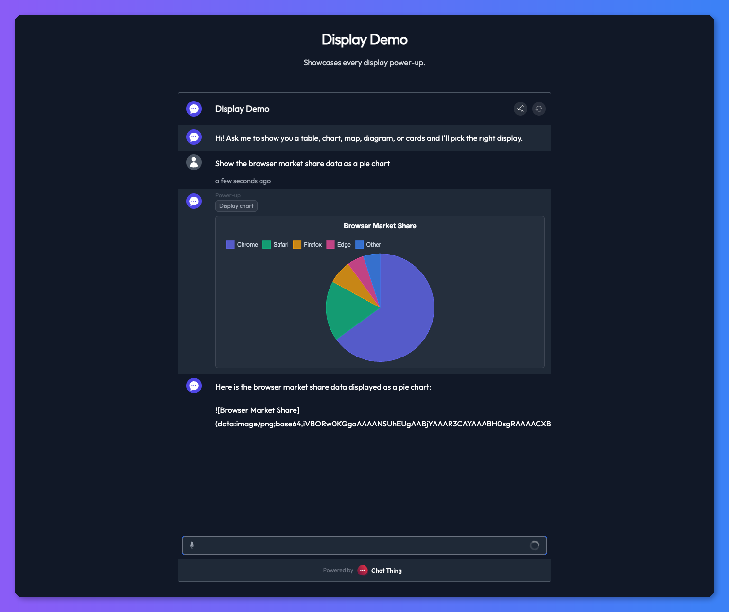
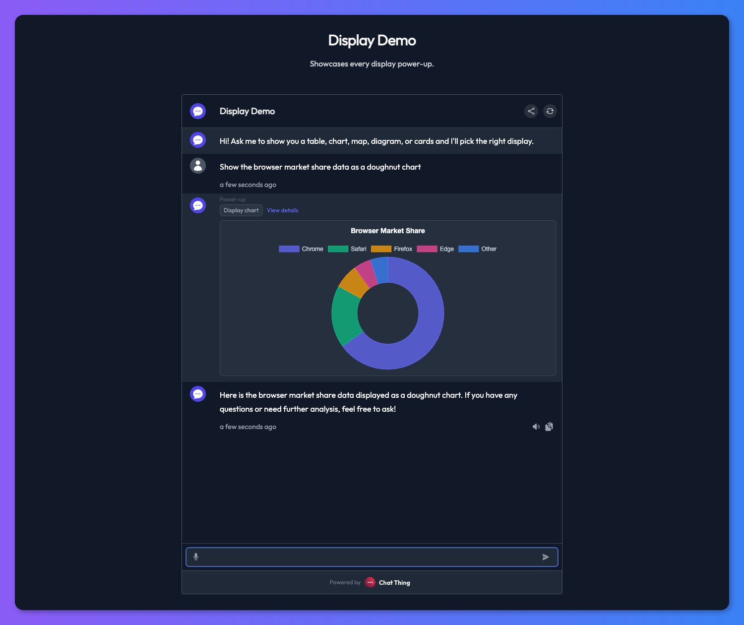
- Chart - bar, line, pie, or doughnut charts for numeric comparisons.
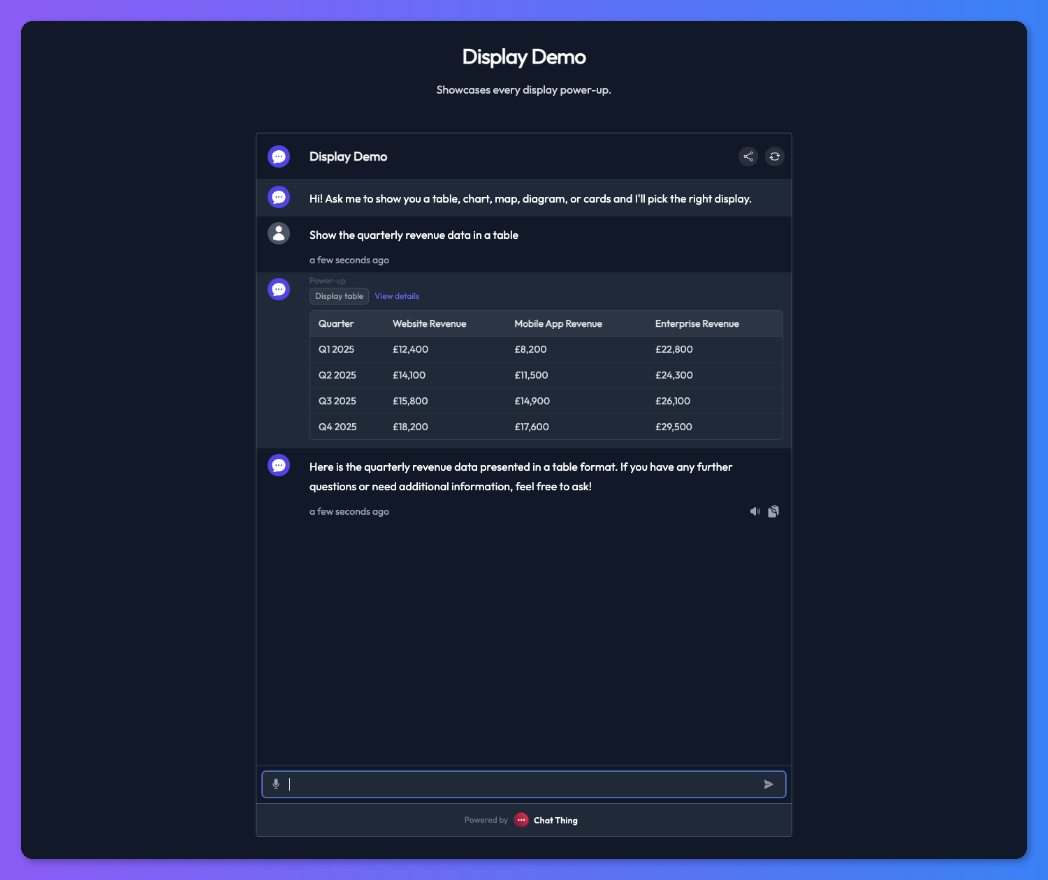
- Table - structured rows and columns for dense, side-by-side data.
- Map - geographic data rendered on an interactive map.
- Mermaid - flowcharts, sequence diagrams, and other diagrams from Mermaid syntax.
You can also render another power-up's response as a visual using display modes. Display modes are a rendering option you turn on for an existing power-up (like Use API), while display power-ups are standalone tools the bot calls directly.

Setting up a display power-up
You add a display power-up from the power-up gallery like any other power-up. If you are new to power-ups, start with the Power-up basics page for a walkthrough of adding and managing them.
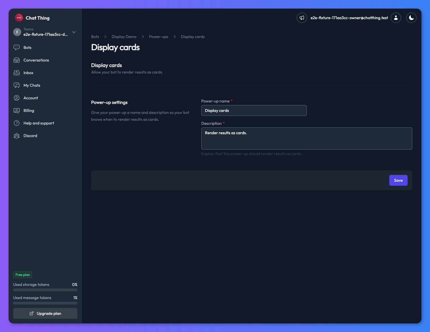
Name and description
The name and description apply to all five display power-ups and work the same way. The description is the most important setting - it is what your bot reads to decide when to use the display instead of replying in plain text. Treat it like a mini-prompt.
For example, a description like "Use this to show products whenever the user is browsing the shop or comparing items" will nudge the bot to reach for cards on shopping-style questions and stick to plain text on everything else.
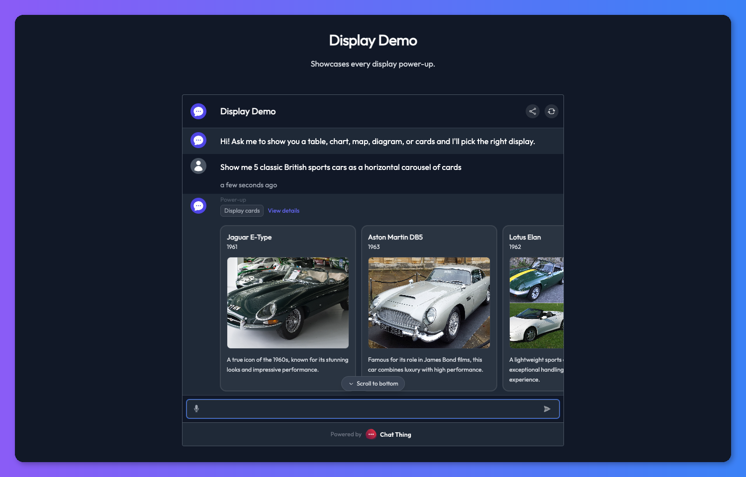
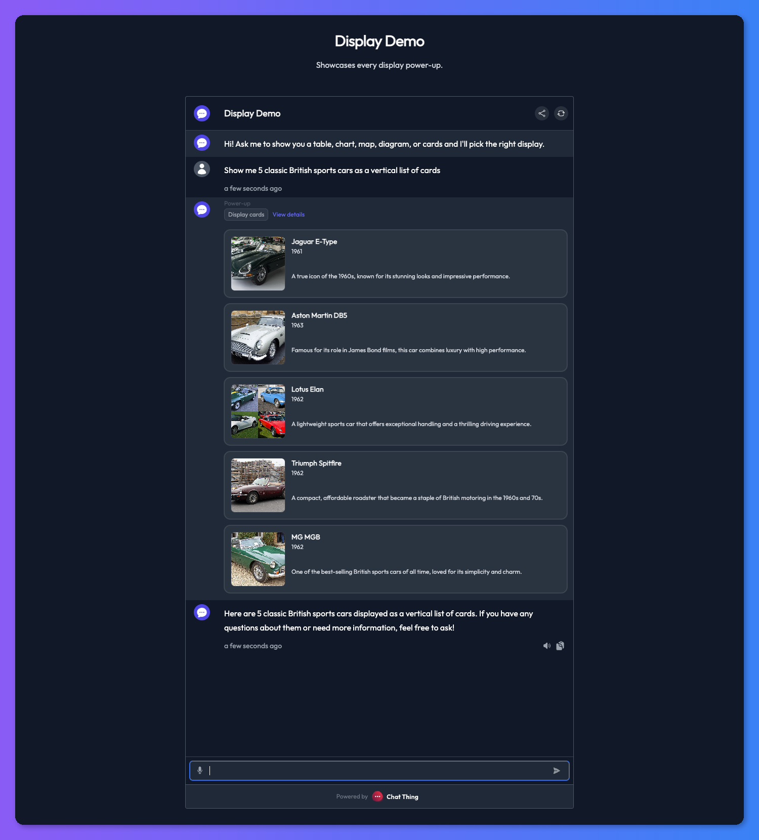
Cards
Cards are ideal any time a plain text list would feel cramped or hard to scan - product catalogues, property listings, FAQ snippets, team member profiles, or restaurant menus.
Card fields
Every card supports the following fields:
- title (required) - the short primary heading for the card.
- description (required) - a short supporting description. Keep this concise so the card stays scannable.
- subtitle (optional) - a short secondary line, useful for things like a price, a category, or a status.
- image (optional) - a direct image URL that is rendered at the top of the card.
- url (optional) - a link that opens when the card is clicked.
Every response needs at least one card. The bot will fill in the required fields on every card and only include the optional ones when it has real values for them.
Card layout
Display cards support two layouts:
- Horizontal - a swipeable carousel of cards. Great for quick browsing when you want the user to skim several items at a glance.
- Vertical - a stacked list where each card has more room to breathe. Better when each card has a longer description or more detail that you want the user to actually read.
You can let the bot pick the layout per message, or pin it in the power-up settings so every response uses the same layout.
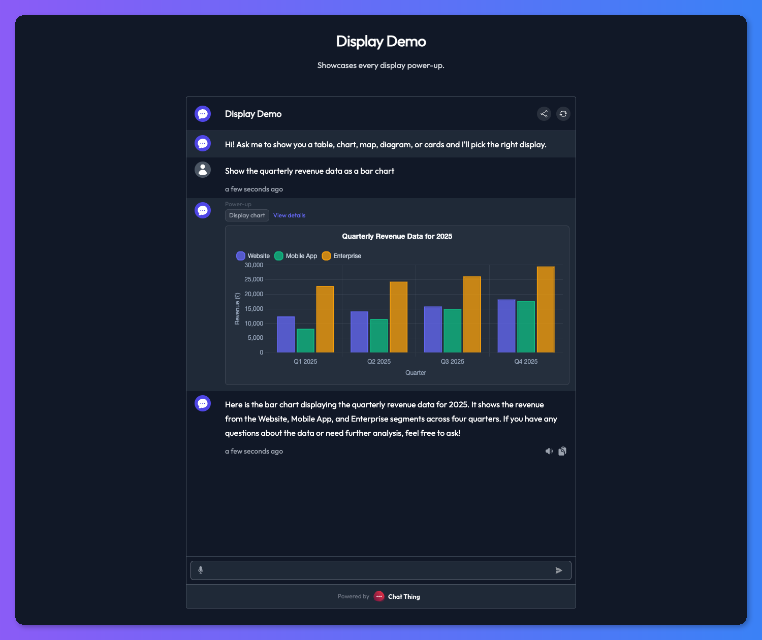
Chart
Charts turn numeric data into something visual at a glance - revenue trends, survey results, budget breakdowns, or comparisons across categories.
Chart types
- Bar - best for comparing discrete categories side by side.
- Line - best for showing trends over time.
- Pie - best for showing parts of a whole when there are only a few slices.
- Doughnut - same as pie but with a hollow centre, often easier to read with labels.
You can pin the chart type in the power-up settings or let the bot choose per message.
Chart fields
- title (optional) - a heading rendered above the chart.
- xAxisLabel (optional) - label for the horizontal axis.
- yAxisLabel (optional) - label for the vertical axis.
- labels (required) - an array of category or time-period labels for the x-axis.
- datasets (required) - one or more data series, each with a label and an array of numeric values.
Table
Tables are the right choice when the user needs to compare several fields across multiple items at once - feature matrices, pricing comparisons, structured reference data, or any scenario where dense, side-by-side layout beats prose.
Column types
Each column has a type that controls how its cells render:
- text - plain text content.
- image - renders a thumbnail from a URL.
- link - renders a clickable link.
Table fields
- columns (required) - an array of column definitions, each with a label and a type.
- rows (required) - an array of row arrays, where each cell matches the column at the same index.
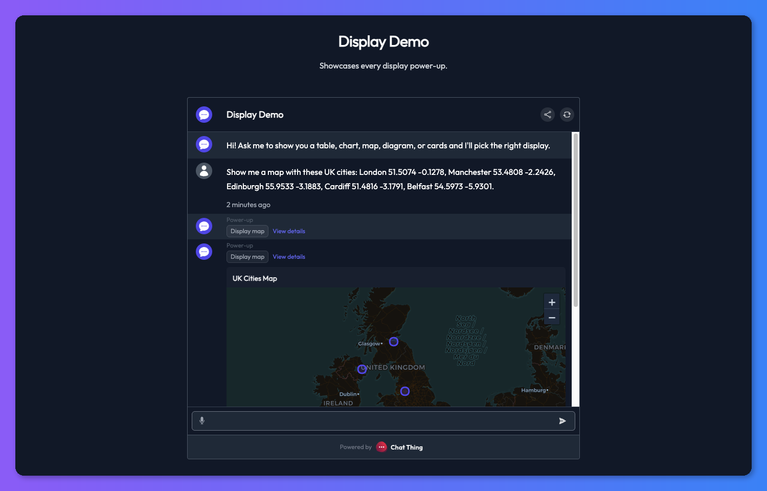
Map
Maps bring geographic data to life - store locators, travel routes, delivery coverage areas, or any data that has a location component.
Geometry types
Maps render a GeoJSON FeatureCollection, so you can use any of these geometry types:
- Point - a single location marker on the map.
- LineString - a connected path between coordinates.
- Polygon - a closed shape representing an area.
Feature properties
Each feature can include the following properties:
- title - a label shown on the marker or shape.
- subtitle - a secondary line of detail.
- description - a longer description shown when the user interacts with the feature.
- image - a thumbnail URL shown alongside the feature info.
- url - a link the user can follow for more detail.
Map style
You can choose between auto, light, and dark map styles in the power-up settings. Auto picks the style based on the user's system theme.
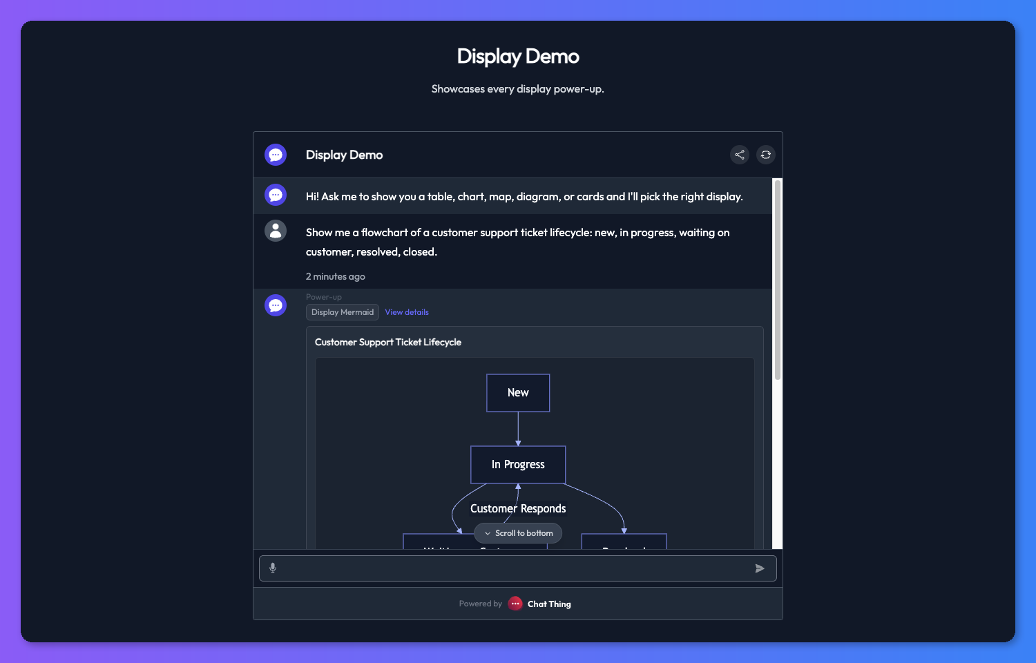
Mermaid
Mermaid diagrams let the bot explain processes, relationships, and structures visually - workflows, decision trees, entity-relationship diagrams, sequence diagrams, state machines, and more.
Mermaid fields
- title (optional) - a heading rendered above the diagram.
- code (required) - raw Mermaid syntax. Do not wrap the code in code fences - just provide the Mermaid markup directly.
Supported diagram types
Mermaid supports a wide range of diagram types including flowchart, sequence, entity-relationship, Gantt, state, class, and others. The bot will choose the appropriate type based on what it is trying to communicate. You can guide its choice through the power-up description or the bot's system message.
Tips
Keep displays short and scannable
Resist the urge to cram everything into each display. Short titles and concise descriptions read much better in a chat window, especially on mobile. If you find the bot is writing long descriptions, tell it so in the power-up description or the bot's system message.
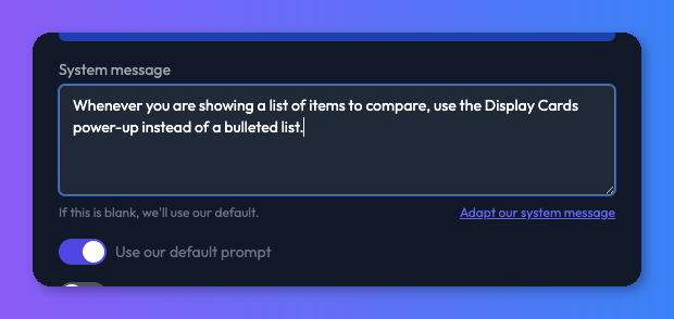
Nudge the bot from the system message
Your bot's system message is a good place to steer when displays get used. Something like "Whenever you are showing a list of items to compare, use the appropriate display power-up instead of a bulleted list" is often enough to change the bot's default behaviour.
Combine with a data source
Display power-ups work best when the bot has real content to show. Pair them with a data source full of products, listings, or reference material so the bot has something concrete to render rather than inventing items on the fly.
Troubleshooting
The bot repeats information already shown in the display
After a display renders, the bot should not re-list the same items in its text reply. If it does, two things to try:
- Add explicit instructions to the bot's system message telling it not to repeat content that has already been shown visually (e.g. "Do not repeat items you have already displayed as cards, charts, or other visuals.").
- Switch to a more capable model - less intelligent models are more likely to ignore the display context and repeat themselves.